


Studio Palette Notes
Stylists who work with the sample rooms ask for the same three things: a colour list, a JSON-shaped spec for the mood board, and a reminder that plaster is not quite white. Tokens, a chair record, and a table of what each colour must not fight.
NORDIC is a sample storefront built with Fatleon. This journal shows how a merchant blog page can look — cover, summary, photographs, and tables. To learn more about Fatleon, visit fatleon.com.
Stylists who work with the sample rooms ask for the same three things: a colour list, a JSON-shaped spec they can drop into a mood board, and a reminder that plaster is not quite white. These interiors are invented for walking through. The tokens exist so a photograph, a wall, and a chair stay in one key — not so a merchant can ship a paint tin.
Room tokens
These custom properties are studio shorthand. They are not a public API. They keep a still, a lime wash, and a seat from arguing when three people are styling the same corner on different days.
:root {
  --nordic-plaster: #f4efe6;
  --nordic-oak: #c4a574;
  --nordic-leather: #b57a4a;
  --nordic-slate: #6b6e73;
  --nordic-ink: #2c2a28;
  --nordic-sea: #8aa0b0;
}
--nordic-plaster is the wall before the chair arrives. --nordic-oak is timber in even light. --nordic-leather is the only warm plane we allow unless the brief says otherwise. Ink and sea are for shadow and a single cool note; they are not a second palette.
What a token must not fight
A hex value is useless if you do not know what it is allowed to sit beside. We keep a short table in the studio, the way a merchant keeps sizes on a product page. It is not a rule for every apartment. It is a reminder that colour is a neighbour, not a brand.
| Token | Material | Where it sits | Must not fight |
|---|---|---|---|
| plaster | Lime wash, undyed linen | Walls, a quiet seat | Optical white, a blue lamp |
| oak | White oak, oil | Frames, floorboards | Orange stain, high-gloss lacquer |
| leather | Aniline hide | One warm plane | Brass plus terracotta together |
| slate | Oxidised metal, shadow | Hardware, a dark throw | Navy pretending to be black |
Stand in the corner. If the wall looks colder than the timber, the plaster has been mixed too blue. If the leather looks like a catalogue swatch, you have added a second warm and the room has started to sell.
A chair, as data
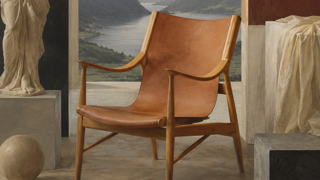
When a set designer asks what the object is, we send a small record. It keeps names and SKUs from drifting between languages. The HAVN Wool Lounge Chair is the chair we use when the wall is already plaster and the floor is already oak. The JSON is not the product. It is a way not to lose the product while we talk.
{
  "slug": "havn-wool-lounge",
  "family": "lounge",
  "frame": "white-oak",
  "seat": "wool-or-leather",
  "palette": ["plaster", "oak", "slate"]
}
How we use it
The record is read in order. Wall first, then family, then the one material that may carry chroma. If you start with the seat, you will buy a textile that the plaster cannot stand.
- Lock the wall to
--nordic-plasterbefore you choose a textile - Pick one chroma: leather, a painting, or a throw — not all three
- Leave the floor lighter than the frame so the legs stay visible
If the hex values start to feel loud, you are over-styling the room. Go back to timber and plaster.
One chroma, not three
Height is a second sentence, not a second colour. The OSLO Upholstered Ottoman gives a lower plane in the same key. It should not introduce a new hex. If the ottoman is leather and the lounge is wool, that is already two materials; do not add a painted tray.
- One wall that reads as plaster, not as white
- One timber that reads as oak, not as honey
- One object allowed to be warm
After the photograph
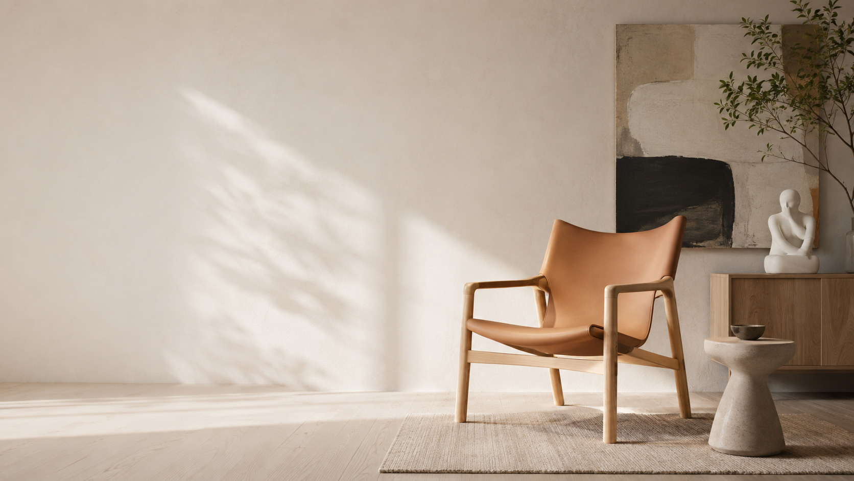
A sample room is easy to overfill once the camera is gone. We still edit. A linen seat such as the Kuopio Linen Armchair belongs when the lounge is already carrying wool; it does not belong as a third texture in the same frame.
The point is not to publish a style guide. It is to keep a wall, a photograph, and a chair from arguing in rooms that were built to be walked through.
